
Her right thigh looks EITHER.. slightly too thin or too thin AND her right calf is definitely too large in both respects. The right foot looks ..not right either. Couldn't say on how to remedy that though.
Otherwise great ^^
Jumbo70's Art Garden
Forum rules
This forum is for posting and collaborating upon third party work. Please do not post request-threads, and avoid posting artwork that is not your own unless it is being used as a reference.
When posting content, please consider including a screenshot to help users to see what a game is like.
This forum is for posting and collaborating upon third party work. Please do not post request-threads, and avoid posting artwork that is not your own unless it is being used as a reference.
When posting content, please consider including a screenshot to help users to see what a game is like.
Re: Jumbo70's Art
![]() by ByHisBillowingBeard » Wed Aug 08, 2012 3:05 am
by ByHisBillowingBeard » Wed Aug 08, 2012 3:05 am
- ByHisBillowingBeard
- Joined: Sat Jan 29, 2011 3:33 am
Re: Jumbo70's Art
![]() by Jumbo70 » Wed Aug 08, 2012 1:54 pm
by Jumbo70 » Wed Aug 08, 2012 1:54 pm
ByHisBillowingBeard Wrote:Her right thigh looks EITHER.. slightly too thin or too thin AND her right calf is definitely too large in both respects. The right foot looks ..not right either. Couldn't say on how to remedy that though.
Otherwise great ^^
I see em when you say em, thanks

-

Jumbo70 - Joined: Tue Nov 01, 2011 3:14 pm
- Location: In your Finnish wardrobe
Re: Jumbo70's Art
![]() by Jumbo70 » Thu Nov 15, 2012 9:32 am
by Jumbo70 » Thu Nov 15, 2012 9:32 am
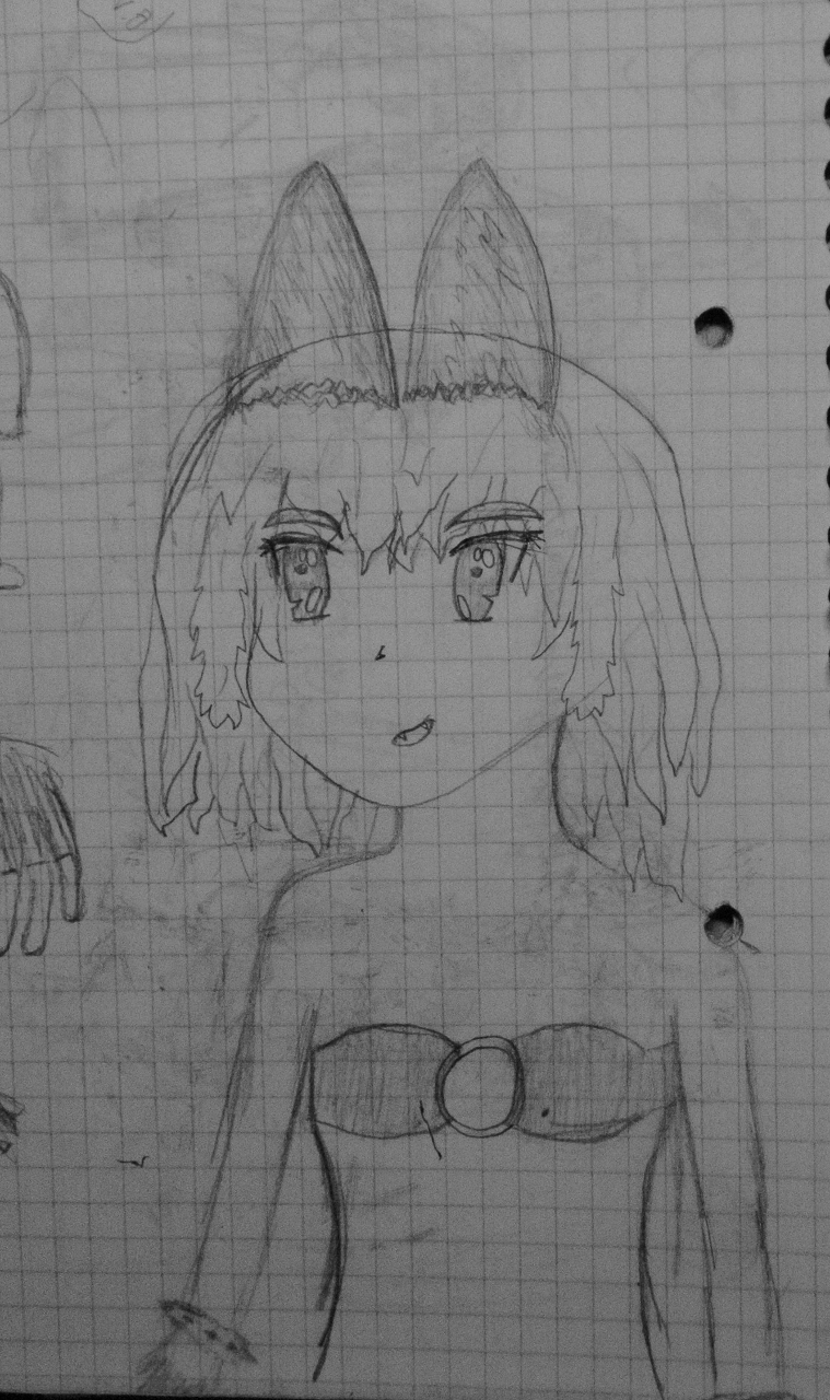
alright, sorry for being inactive for so long, but i somehow felt like drawing without preassure or so, dunno really how to explain, but now im back, atleast for a while XD
....incase you missed me
As always, critique is highly appreciated ^^
Dunno why but seems like im little interested tentacles atm
....incase you missed me
- The hands are way to small but otherwise i think it is ganz gut.
- just a doodle i did little time ago ^^
I found this one interesting enough to post here
As always, critique is highly appreciated ^^
Dunno why but seems like im little interested tentacles atm
-
Jumbo70 - Joined: Tue Nov 01, 2011 3:14 pm
- Location: In your Finnish wardrobe
Re: Jumbo70's Art
![]() by Jumbo70 » Thu Nov 15, 2012 1:10 pm
by Jumbo70 » Thu Nov 15, 2012 1:10 pm
i didnt know if i shouldve added this to the old post but yu modulatorsmoderatos can put it there if you so wish, i dont mind.
Anyhow, ive starter to get the hang of this computer stuff slowly slowly, so here is what ive managed to cook up.
The problem is that i have no clue on how to continue... sounds crazy but its true.
Also ive been doing this on Sai.
also, computer drawing is fun! paper never gets ruined how much you erase ^^
Anyhow, ive starter to get the hang of this computer stuff slowly slowly, so here is what ive managed to cook up.
- the line that goes trough the arm will dissapear once i add some colour.
The problem is that i have no clue on how to continue... sounds crazy but its true.
Also ive been doing this on Sai.
also, computer drawing is fun! paper never gets ruined how much you erase ^^
-
Jumbo70 - Joined: Tue Nov 01, 2011 3:14 pm
- Location: In your Finnish wardrobe
Re: Jumbo70's Art
![]() by KaTsuO_O » Thu Nov 15, 2012 2:46 pm
by KaTsuO_O » Thu Nov 15, 2012 2:46 pm
Seems like I have missed something rather good here. The first tentacle one is great, the background, her and the tentacles just works well together.
What do you mean with continue, coloring?
What do you mean with continue, coloring?
Don't create a porn game if you're only interested in porn.
Wise words regarding criticism http://www.youtube.com/watch?v=-98ZFl1sKt4
Wise words regarding criticism http://www.youtube.com/watch?v=-98ZFl1sKt4
-

KaTsuO_O - Joined: Tue Nov 02, 2010 6:03 pm
Re: Jumbo70's Art
![]() by Jumbo70 » Thu Nov 15, 2012 10:11 pm
by Jumbo70 » Thu Nov 15, 2012 10:11 pm
KaTsuO_O Wrote:Seems like I have missed something rather good here. The first tentacle one is great, the background, her and the tentacles just works well together.
What do you mean with continue, coloring?
Thanks! ^^
What i meant with continue is simply that what should i do next, should i add shadows now or should i add colours, how do i add shadows how this and how that xD
Simply put. Im stupid and i dont know what to do next xD
OwnerOfSuccuby Wrote:Really good arts !
Thanks! ^^
I also wrote this with my phone so sorry for possible fuckups.
-
Jumbo70 - Joined: Tue Nov 01, 2011 3:14 pm
- Location: In your Finnish wardrobe
Re: Jumbo70's Art
![]() by cookie jar » Thu Nov 22, 2012 4:49 pm
by cookie jar » Thu Nov 22, 2012 4:49 pm
Jumbo70 Wrote:What i meant with continue is simply that what should i do next, should i add shadows now or should i add colours, how do i add shadows how this and how that xD
Simply put. Im stupid and i dont know what to do next xD
If the input of a non-graphic artist is permitted, I'd go with shading. (Assuming that's what you meant by shadows.)
Colours are a nice touch but in my personal experience at least proper shading adds more to the character and in depth quality of a picture than colours.
On the downside, I believe shading is also the more difficult of the two options. But I might be wrong there since my "artistic expertise" is in writing and not in drawing.
Having said that, I really like the first of the tentacle pictures. If I'm not terribly mistaken, there are already some aspects of shading in there. So you're alredy going in that direction.
As you already wrote yourself her hands and paws - or feet, if you prefer - still need some work. But again from what I've been told those are some exceptionally difficult aspects of anatomy to get done properly.
All things considered I like your art. And yes, I definitely think it has improved.
If you stumble across any typos, you may keep them and rear new ones in your basement.
-

cookie jar - Joined: Tue Mar 27, 2012 10:36 pm
Re: Jumbo70's Art
![]() by riddlebox1321 » Sun Dec 02, 2012 12:51 am
by riddlebox1321 » Sun Dec 02, 2012 12:51 am
I'm impressed by how much your contour lines and shading have improved. Also your object placement has improved, that is, your sense of distance, far and near. Somethings I suggest to improve your artwork and bring it more to life include:
-Trying different styles of drawing, mix and match utensils. (Pencil light sketch for fist contour lines, Pen for permanent, then erase pencil where you traced.)
-Using a specialized blender, cloth or piece of paper to shade instead of fingers.(The sweat and oils from your fingers and hands can cause graphite, lead, charcoal, ebony and even ink to smear or soak into the paper causing undesired blobs that are difficult or even impossible to remove.)
-Consider the direction of the light source or sources, how much light is used, and how close the object is to the "Viewer" and the light source. (Using more or less pressure/layer of the color or shade used, darkening or lightening the hue and manipulating the size of the object or part of object can add a 3d real life feel to your art.)
-Consider shape of object and how the light would land and bounce off of it. (Shade with the contour line. If it is a sphere, then you wouldn't shade it in one direction, you would shade in the direction of the shape and place the center or "highlight" closest to the light where the most light falls recreating the same shape with shades or colors varying in intensity of hues. If it were a cube you would shade the direction the light falls because it's a flat surface.)
-Consider the texture you are trying to create. Is it smooth? Rough? Bumpy? Jagged? (Lines can be soft or sharp depending on how you place your pencil. Side or tip? Hard or soft pressure? Types of lines can create shading in repetition. Lines - hatch/cross hatch. Dots - stippling. The shading can become lighter or darker depending on spacing, layer and pressure.)
-After drawing the basic contour lines, focus on fine deviation of those lines. Are there small curves you didn't notice or think about adding before?
-And finally, don't worry if it isn't perfect, an art form takes practice and time to perfect and even when the professionals do it it isn't 100%. If someone judges harshly don't get discouraged, instead take it as an opportunity to improve. If you feel pressured by what others think then remember that art is simply a form of expression and you are doing it for yourself and sharing your view afterwards.
You have a lot of pent up creativity waiting to be expressed. This was my advice, you can use or discard it as you see fit.
My latest side projects: https://drive.google.com/folderview?id=0B2Xg68C9gNthZnZZNHFOWVBkbDg&usp=sharing
An inactive member of the Sim Brothel development board, still stop by when you're ... bored.
http://sim-brothel-v2.bigforumpro.com/
An inactive member of the Sim Brothel development board, still stop by when you're ... bored.
http://sim-brothel-v2.bigforumpro.com/
-

riddlebox1321 - Joined: Fri Nov 30, 2012 9:22 am
- Location: Oregon
Re: Jumbo70's Art
![]() by Jumbo70 » Mon Dec 03, 2012 4:28 pm
by Jumbo70 » Mon Dec 03, 2012 4:28 pm
cookie jar Wrote:If the input of a non-graphic artist is permitted, I'd go with shading. (Assuming that's what you meant by shadows.)
Colours are a nice touch but in my personal experience at least proper shading adds more to the character and in depth quality of a picture than colours.
On the downside, I believe shading is also the more difficult of the two options. But I might be wrong there since my "artistic expertise" is in writing and not in drawing.
Having said that, I really like the first of the tentacle pictures. If I'm not terribly mistaken, there are already some aspects of shading in there. So you're alredy going in that direction.
As you already wrote yourself her hands and paws - or feet, if you prefer - still need some work. But again from what I've been told those are some exceptionally difficult aspects of anatomy to get done properly.
All things considered I like your art. And yes, I definitely think it has improved.
Thanks ^^
Problem is that im very bad with colours
I think and i hope that i am getting slowly better at feet and hands but we will see about that
riddlebox1321 Wrote:I'm impressed by how much your contour lines and shading have improved. Also your object placement has improved, that is, your sense of distance, far and near. Somethings I suggest to improve your artwork and bring it more to life include:
-Trying different styles of drawing, mix and match utensils. (Pencil light sketch for fist contour lines, Pen for permanent, then erase pencil where you traced.)
-Using a specialized blender, cloth or piece of paper to shade instead of fingers.(The sweat and oils from your fingers and hands can cause graphite, lead, charcoal, ebony and even ink to smear or soak into the paper causing undesired blobs that are difficult or even impossible to remove.)
-Consider the direction of the light source or sources, how much light is used, and how close the object is to the "Viewer" and the light source. (Using more or less pressure/layer of the color or shade used, darkening or lightening the hue and manipulating the size of the object or part of object can add a 3d real life feel to your art.)
-Consider shape of object and how the light would land and bounce off of it. (Shade with the contour line. If it is a sphere, then you wouldn't shade it in one direction, you would shade in the direction of the shape and place the center or "highlight" closest to the light where the most light falls recreating the same shape with shades or colors varying in intensity of hues. If it were a cube you would shade the direction the light falls because it's a flat surface.)
-Consider the texture you are trying to create. Is it smooth? Rough? Bumpy? Jagged? (Lines can be soft or sharp depending on how you place your pencil. Side or tip? Hard or soft pressure? Types of lines can create shading in repetition. Lines - hatch/cross hatch. Dots - stippling. The shading can become lighter or darker depending on spacing, layer and pressure.)
-After drawing the basic contour lines, focus on fine deviation of those lines. Are there small curves you didn't notice or think about adding before?
-And finally, don't worry if it isn't perfect, an art form takes practice and time to perfect and even when the professionals do it it isn't 100%. If someone judges harshly don't get discouraged, instead take it as an opportunity to improve. If you feel pressured by what others think then remember that art is simply a form of expression and you are doing it for yourself and sharing your view afterwards.
You have a lot of pent up creativity waiting to be expressed. This was my advice, you can use or discard it as you see fit.
Thanks! ^^
Thanks for the tips! ^^ Appreciate it!
For shading, should it be a specific kind of cloth or paper or is just regular torn out piece from the corner good enough?
Ive always used only one pencil (wich is not so good, i think) but ive slowly started using a harder pencil for those sketches and then smashing some heavier lines with a softer pencil on top of it, but meaby i should stay a little longer with the hard one than now, il try and see the results ^^
Alas new pictures!
- Some kind of concept art of a possible game i might try to cook up (or a animation)
name and story of the gamemation is, but i lack the skill of flash to do it, so untill i find the "Create a Flash game!" button its in ice.
So, yeah... another one of these
i tried to put more shadows on this one but im not sure bout the result, so i'm hoping if some of you could tell me if it is a succes or a failure.
- LANDSCAPE!
i just noticed that the shades on the mountains are wayy off, so ignore them ok ^^
so, i tried to make a lanscape, sort of did it too
The face is strange but thats about it i can say bout the picture, hope you can tell me more where to improve ^^
Both pictures were made before those two posts, but i just didnt find the time to post these.
-
Jumbo70 - Joined: Tue Nov 01, 2011 3:14 pm
- Location: In your Finnish wardrobe
Re: Jumbo70's Art
![]() by riddlebox1321 » Tue Dec 04, 2012 10:04 pm
by riddlebox1321 » Tue Dec 04, 2012 10:04 pm
Jumbo70 Wrote:Thanks for the tips! ^^ Appreciate it!
For shading, should it be a specific kind of cloth or paper or is just regular torn out piece from the corner good enough?
Ive always used only one pencil (wich is not so good, i think) but ive slowly started using a harder pencil for those sketches and then smashing some heavier lines with a softer pencil on top of it, but meaby i should stay a little longer with the hard one than now, il try and see the results ^^
The only thing that matters about the cloth is the texture of it. Different textures of cloth effect how the shading comes out.
My latest side projects: https://drive.google.com/folderview?id=0B2Xg68C9gNthZnZZNHFOWVBkbDg&usp=sharing
An inactive member of the Sim Brothel development board, still stop by when you're ... bored.
http://sim-brothel-v2.bigforumpro.com/
An inactive member of the Sim Brothel development board, still stop by when you're ... bored.
http://sim-brothel-v2.bigforumpro.com/
-
riddlebox1321 - Joined: Fri Nov 30, 2012 9:22 am
- Location: Oregon
Re: Jumbo70's Art
![]() by Jumbo70 » Thu Dec 06, 2012 8:54 am
by Jumbo70 » Thu Dec 06, 2012 8:54 am
riddlebox1321 Wrote:The only thing that matters about the cloth is the texture of it. Different textures of cloth effect how the shading comes out.
Alright, thanks!
sidenote: my first ever flash animation (phatetic, i know.... but kinda funny tough)
- ebin.gif (28.52 KiB) Viewed 3020 times
-
Jumbo70 - Joined: Tue Nov 01, 2011 3:14 pm
- Location: In your Finnish wardrobe
Re: Jumbo70's Art
![]() by Thaedael » Sat Dec 08, 2012 11:41 am
by Thaedael » Sat Dec 08, 2012 11:41 am
Mmm. How I love drawing with leads. Before I forsaken all traditional media in favor of digital media (besides what I am forced to do within my program that actually does use leads) I was a huge fan of the leads and charchoals. A quick primer on lead would be that the harder series (in ascending order) are harder. They make lighter lines that are easier to control with precision, as well as easier to erase since you are not pressing onto your media too hard (from normal paper to canvas etc.) They are also easier to erase from knead-able erasers. Bs are known as the bolds, and lay a thicker shading down, though not as even a coverage. Especially useful for blending, and can be used in conjunctions with the hard. I really reccomend trying to work with the full spectrum, since it really does expand your horizons. My favorite experiments in highschool art classes long ago (my god did I ever have the best art teacher) was to work on one spectrum to all exclusion, then the other. With the hards try and make every soft and not as clearly defined, while everything with the bold spectrum dark and clearly defined. All sorts of fun could be had, especially when trying to combine lighting into it.
- Thaedael
 Re: Jumbo70's Art and Flash
![]() by Jumbo70 » Sat Dec 08, 2012 11:58 am
by Jumbo70 » Sat Dec 08, 2012 11:58 am
Thaedael Wrote:Mmm. How I love drawing with leads. Before I forsaken all traditional media in favor of digital media (besides what I am forced to do within my program that actually does use leads) I was a huge fan of the leads and charchoals. A quick primer on lead would be that the harder series (in ascending order) are harder. They make lighter lines that are easier to control with precision, as well as easier to erase since you are not pressing onto your media too hard (from normal paper to canvas etc.) They are also easier to erase from knead-able erasers. Bs are known as the bolds, and lay a thicker shading down, though not as even a coverage. Especially useful for blending, and can be used in conjunctions with the hard. I really reccomend trying to work with the full spectrum, since it really does expand your horizons. My favorite experiments in highschool art classes long ago (my god did I ever have the best art teacher) was to work on one spectrum to all exclusion, then the other. With the hards try and make every soft and not as clearly defined, while everything with the bold spectrum dark and clearly defined. All sorts of fun could be had, especially when trying to combine lighting into it.
Heh
you had luck, my arts teacher was little... different. Loved to show her works but rarley made us do anything except theory.... anatomy, art history, you name it.
- alas, new one.... tentacles..... :D
im really active now, atleast i think so myself ^^
constructive critique plz ^^
Im trying to think more and more of lightning, using more harder pencils, drawing crap and learning flash.
So il rename this hood to: "Jumbo70's art and flash"! aah, what an original and neat name i choose.
but i think itl take a while before i post a flash that is worth posting, but then again the first flash i did is not worth posting but i still posted it....
-
Jumbo70 - Joined: Tue Nov 01, 2011 3:14 pm
- Location: In your Finnish wardrobe
Re: Jumbo70's Art and Flash
![]() by KaTsuO_O » Sat Dec 08, 2012 12:29 pm
by KaTsuO_O » Sat Dec 08, 2012 12:29 pm
Want some private teaching? I can be your shortcut to be able to post animations that is worth posting.
I wasn't going to say anything about the latest art, don't really feel like writing that much now. Though, I'd say the cum is something you could work on, it looks lumps and that cum shot looks really odd because of it. Try to make it thinner, the thinnest parts can just be a pencil line thin.
I wasn't going to say anything about the latest art, don't really feel like writing that much now. Though, I'd say the cum is something you could work on, it looks lumps and that cum shot looks really odd because of it. Try to make it thinner, the thinnest parts can just be a pencil line thin.
Don't create a porn game if you're only interested in porn.
Wise words regarding criticism http://www.youtube.com/watch?v=-98ZFl1sKt4
Wise words regarding criticism http://www.youtube.com/watch?v=-98ZFl1sKt4
-
KaTsuO_O - Joined: Tue Nov 02, 2010 6:03 pm
Re: Jumbo70's Art and Flash
![]() by OwnerOfSuccuby » Sat Dec 08, 2012 2:08 pm
by OwnerOfSuccuby » Sat Dec 08, 2012 2:08 pm
I really like your arts  It has good furrys on it and you draw very good. It is very good that you are learning flash
I do not know is it good idea or not - but may be you should try to draw some thing in flash - or draw it on the paper and do not colour it - then put it in flash and encircle it by for example line tools in flash and try to colour it in it ?
If so you can already make good flash models in flash if it will work
If you will have some questions - you can ask me - may be i can help with it - but i am not as good as Corta / Gorepete / Katsu ... and etc in animation and drawing - but i can answer some questions about coding and etc..
I tried to learn how to draw - but i can not draw some thing that i can imagen in my head . I can draw only if i see some object and draw some thing resembling to it. And it takes too long time - so i am realy bad in it i think.
For example if i see picture of girl (or may be some toy of spider man ) - i can draw girl in the same position - or may be a little change it / change it proportions - make it look more like elf / or some body else but if i have no object that i can look on - i can not draw anything
So i can only copy or redraw object that i can see or make it with changes on my current level I can not draw objects just based on my free will
I do not know is it good idea or not - but may be you should try to draw some thing in flash - or draw it on the paper and do not colour it - then put it in flash and encircle it by for example line tools in flash and try to colour it in it ?
If so you can already make good flash models in flash if it will work
If you will have some questions - you can ask me - may be i can help with it - but i am not as good as Corta / Gorepete / Katsu ... and etc in animation and drawing - but i can answer some questions about coding and etc..
I tried to learn how to draw - but i can not draw some thing that i can imagen in my head
For example if i see picture of girl (or may be some toy of spider man
So i can only copy or redraw object that i can see or make it with changes on my current level
- OwnerOfSuccuby
- Joined: Fri Jun 11, 2010 9:33 pm
Re: Jumbo70's Art and Flash
![]() by Jumbo70 » Sat Dec 08, 2012 2:34 pm
by Jumbo70 » Sat Dec 08, 2012 2:34 pm
KaTsuO_O Wrote:Want some private teaching? I can be your shortcut to be able to post animations that is worth posting.
I wasn't going to say anything about the latest art, don't really feel like writing that much now. Though, I'd say the cum is something you could work on, it looks lumps and that cum shot looks really odd because of it. Try to make it thinner, the thinnest parts can just be a pencil line thin.
Thanks for the offer ^^
but il save it for now because theres much shit going on in school and i really dont have time to sit down and ponder, how to do this, how to do that and so on.
but i think il have much freetime in a month or two and then id be interested in some schoolin ^^
I hope your offer still stands then ^^
and i agree with the cumming things.
(to be honest, im drawing around an hour before i go sleep, so that tells something
OwnerOfSuccuby Wrote:I really like your arts
I do not know is it good idea or not - but may be you should try to draw some thing in flash - or draw it on the paper and do not colour it - then put it in flash and encircle it by for example line tools in flash and try to colour it in it ?
If so you can already make good flash models in flash if it will work
If you will have some questions - you can ask me - may be i can help with it - but i am not as good as Corta / Gorepete / Katsu ... and etc in animation and drawing - but i can answer some questions about coding and etc..
I tried to learn how to draw - but i can not draw some thing that i can imagen in my head
For example if i see picture of girl (or may be some toy of spider man
So i can only copy or redraw object that i can see or make it with changes on my current level
aye, i started the same way, and id say you are good at drawing, just hone your skills and youl get better ^^
also if you want to see where i started all this sheet, here you go
https://d.facdn.net/art/crasy/132051929 ... _wanha.jpg (say if you cant open it and i try do something cool to make it open)
^^^^
is about 5 years old and i had a refference picture beside me.... i think the anime where this is from is "Magical Pokaan" (or somethin in that direction) and the character is "Liru"
We all start somewhere ^^
-
Jumbo70 - Joined: Tue Nov 01, 2011 3:14 pm
- Location: In your Finnish wardrobe
Re: Jumbo70's Art and Flash
![]() by Zeus Kabob » Tue Dec 11, 2012 10:39 pm
by Zeus Kabob » Tue Dec 11, 2012 10:39 pm
Oh man, I hadn't checked this in a while, and your new art is all so good! Your art is awesome, and I'm happy to see more of it!
-

Zeus Kabob - Moderator
- Joined: Tue Nov 16, 2010 2:16 am
- Location: Between some awesome thunderheads
Re: Jumbo70's Art and Flash
![]() by Jumbo70 » Wed Dec 12, 2012 12:58 pm
by Jumbo70 » Wed Dec 12, 2012 12:58 pm
Zeus Kabob Wrote:Oh man, I hadn't checked this in a while, and your new art is all so good! Your art is awesome, and I'm happy to see more of it!
Thanks! ^^
-
Jumbo70 - Joined: Tue Nov 01, 2011 3:14 pm
- Location: In your Finnish wardrobe
Re: Jumbo70's Art and Flash
![]() by Jumbo70 » Wed Dec 12, 2012 2:28 pm
by Jumbo70 » Wed Dec 12, 2012 2:28 pm
ok, i made a little flash but id like to move and flip and change the size of it, how do i do that one?
or atleast move it to the middle, i think i can do the rest with Sai or Gimp.
- Untitled-2.gif (17.05 KiB) Viewed 2307 times
or atleast move it to the middle, i think i can do the rest with Sai or Gimp.
-
Jumbo70 - Joined: Tue Nov 01, 2011 3:14 pm
- Location: In your Finnish wardrobe
Who is online
Users browsing this forum: No registered users